Logos
The Henry Community Health logo is the cornerstone of the brand’s identity. It symbolizes trust, care, and connection, and should always be used with consistency and respect.
Primary logo
The horizontal logo is for general use where there is enough space to make a big, branded impression. (Materials need to reference the whole health system).
Stacked logo graphic
The stacked logo should be used when there is limited space and on any scrubs/polos/uniforms.
Reverse logo graphic
The reverse logo can be used when on a darker background, where the primary colored logo cannot be visible.
Avatar logo graphic
The avatar logo may be used when there isn’t enough space for either logo. Cannot be combined with any other logo and cannot replace the HC in the primary logo.
This version is the only time the HC can appear separate from the text ‘Henry Community Health’.
Office logos
The office logos are used on documentation for each individual office and for marketing purposes, such as billboards and social media. These are not used for uniforms.

Marketing approval
Use of any variation of the Henry Community Health logos must be approved through marketing. Creating clothing or other items without the permission of the marketing team is strictly prohibited.
Logo do’s and don’ts
Clear space
Clear space refers to the area surrounding the logo that is left empty. This padding helps frame and distinguish it from other components of the design.
Logos must have a minimum clear space of at least the height of the “HC” around them. No other content should be within this clear space.
Color options
The logo can only appear in our blue and green or in all white.
If it is on metal, it can be black.
Unacceptable use

Don’t change colors

Don’t distort

Don’t add a shadow

Don’t alter or manipulate the mark

Don’t rotate

Don’t outline

Don’t screen
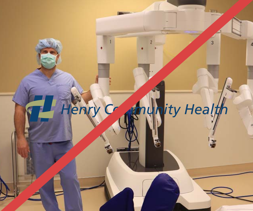
Don’t use over a photo
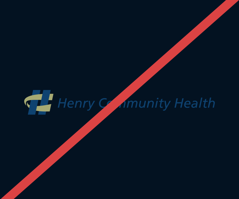
Don’t place on dark colors